
Montauk
City Rebrand
For a University assignment, I was assigned to research existing cities and find one that interested me - and could use a revitalized rebrand.
*Current Branding on Website*
Montauk was a staple location that influenced my design work when I first began, up until now. The majority, if not all, of my design work and photography (not included on this portfolio), is influenced by nature. But the idea of what Montauk is was the biggest influence of all.
Sourced from Montauk's website:
"Montauk is known for beautiful beaches, oceanfront places to stay; things to do for kids; fishing; surfing; paddling; seafood restaurants; nature trails; events; music and art festivals; and weddings. Montauk Point State Park is home to the national landmark, the historic Montauk Point Lighthouse."

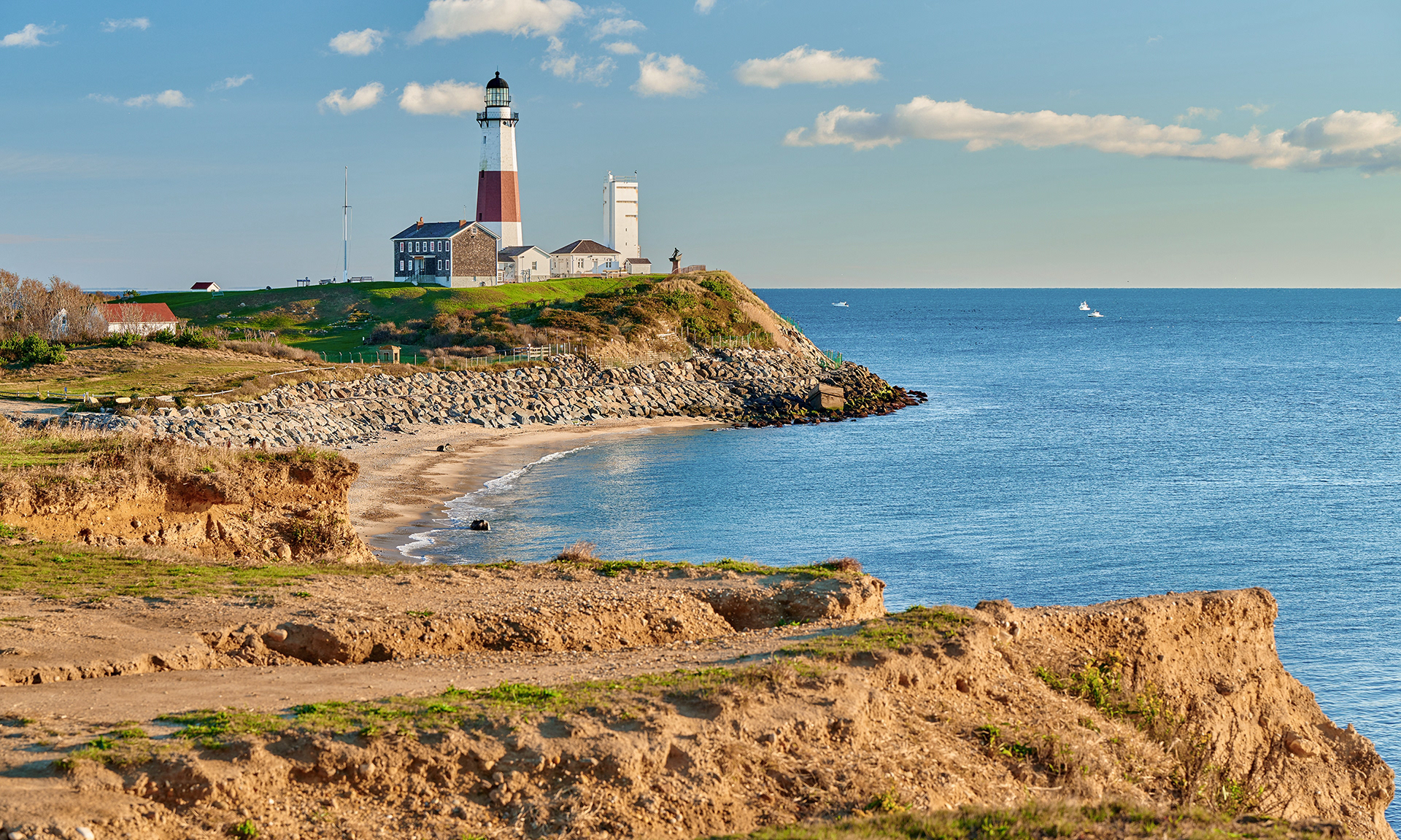
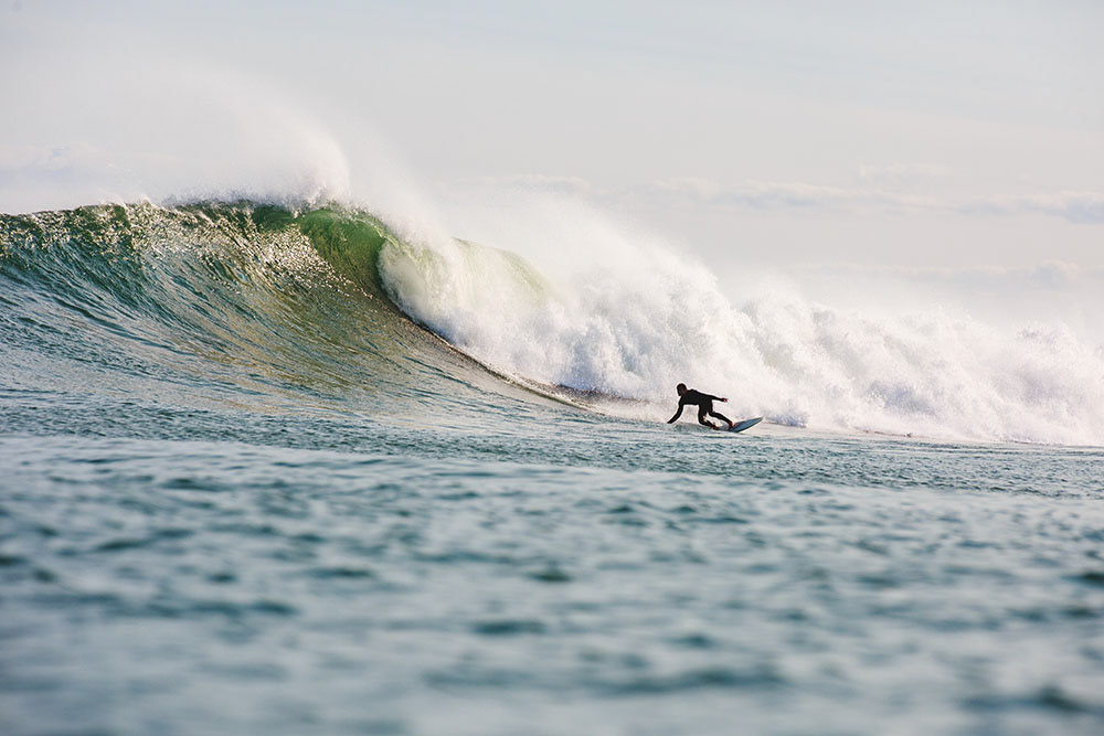
As someone who grew up being a part of a beach town on Long Island, Montauk was the epitome of the north east beach town "aesthetic". It had age, and you could see the wear and tear on the board walks and docks of the brutal winter it endures every year. It had surf, something I always loved to watch and am currently a surf photographer as a fun hobby that I love. It was far away enough you could go to "the end of the wold", or the end of an over populated Long Island that you can never rap your head around how many people actually live there, currently, over 8 million if you were wondering.
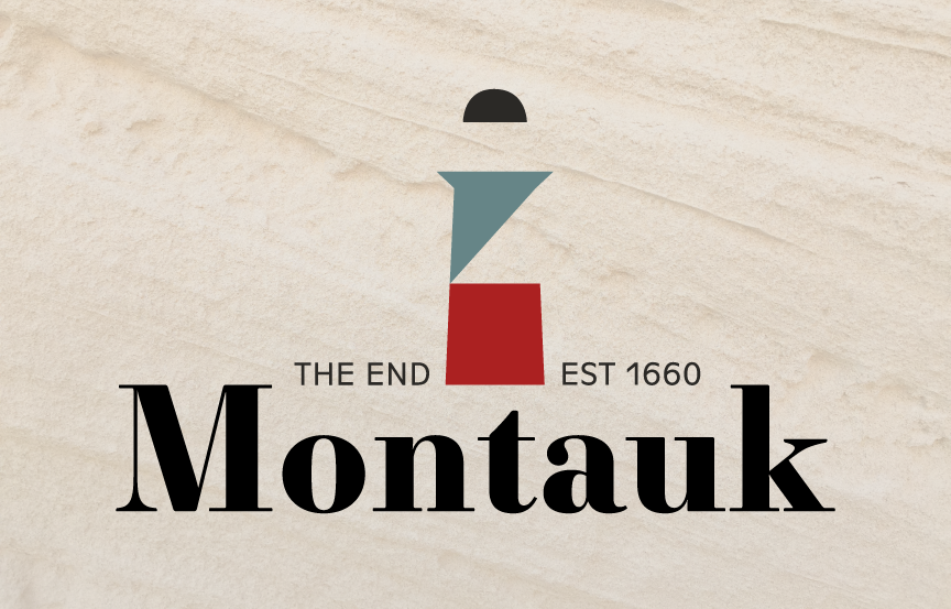
My take on this re-branded logo came more from what Montauk feels like to me.
The color palette was sourced from multiple images taken at the Montauk Point Lighthouse. I made the creative decision the reduce the saturation and intensity of the blue green color to soften the feel and balance out the deep intense red. This game me the result of an aged feeling.
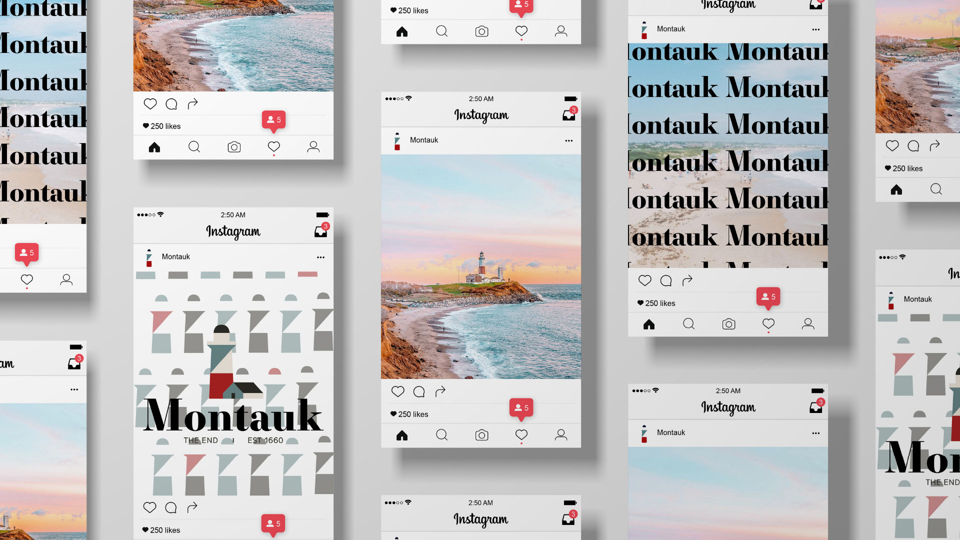
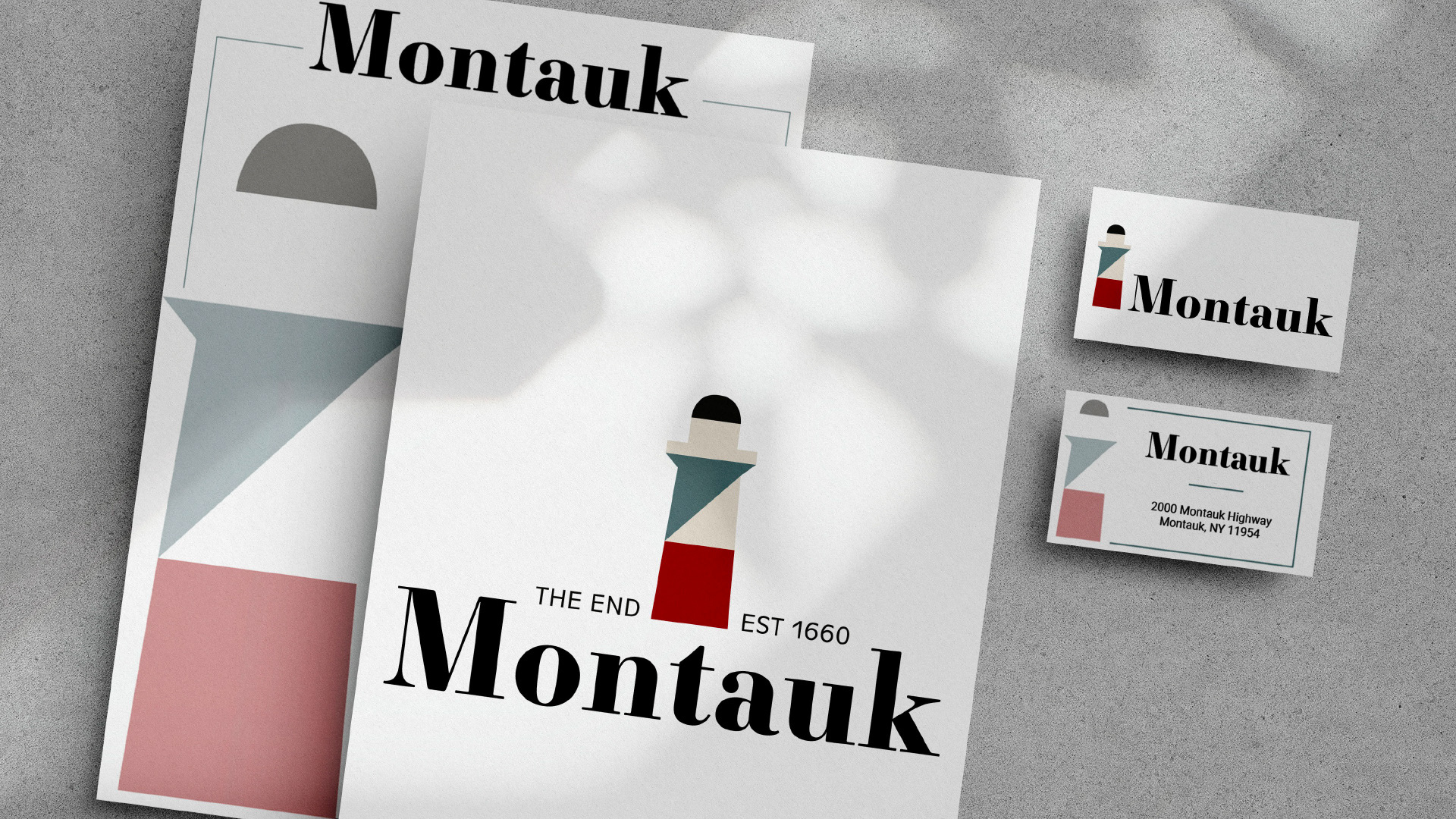
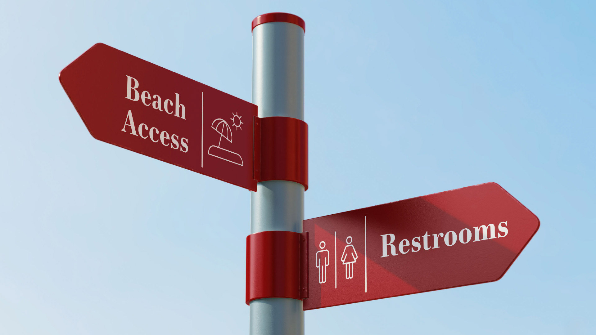
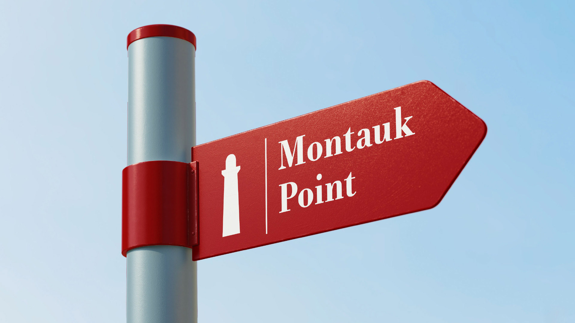
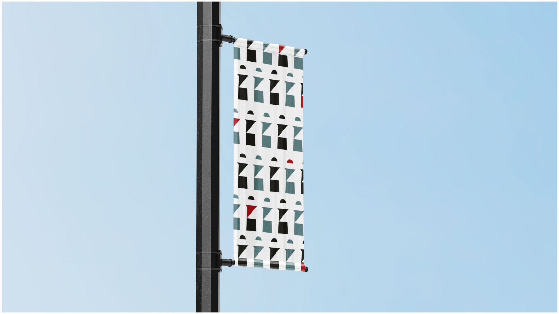
Since I was updating the main logo, I decided to mock up what this new branding could look like online, official town documents, and Environmental Graphic Design.